I’m not sure what it’s like for you fellow dubbers but for me, most things are a bit of a phycological journey. Whether its a 10k run or a van conversion.
On the whole I’m sure we all love the renovation process and its just as much about the journey as it is the destination. However, I’m sure there are jobs for all of us that are a bit of a pain in the posterior. For me I’d say the never ending list of jobs to do are split 50/50 into happy jobs/sad jobs.
With this in mind I tend to renovate in bite sized sessions which comprise of some sad jobs that need to be done, leaving a happy job at the end to finish the session on a high. I find having something to look forward to spurs me on and finishing on a good note enthuses me for the next session.
I’m sure you all have your own ways of dealing with this but its always good to share. I’d love to hear some of your techniques in the comments section below.
I am also aware that I am an impatient man and many of you will more than likely be more patient and measured negating the need for the afore mentioned phycological solutions.
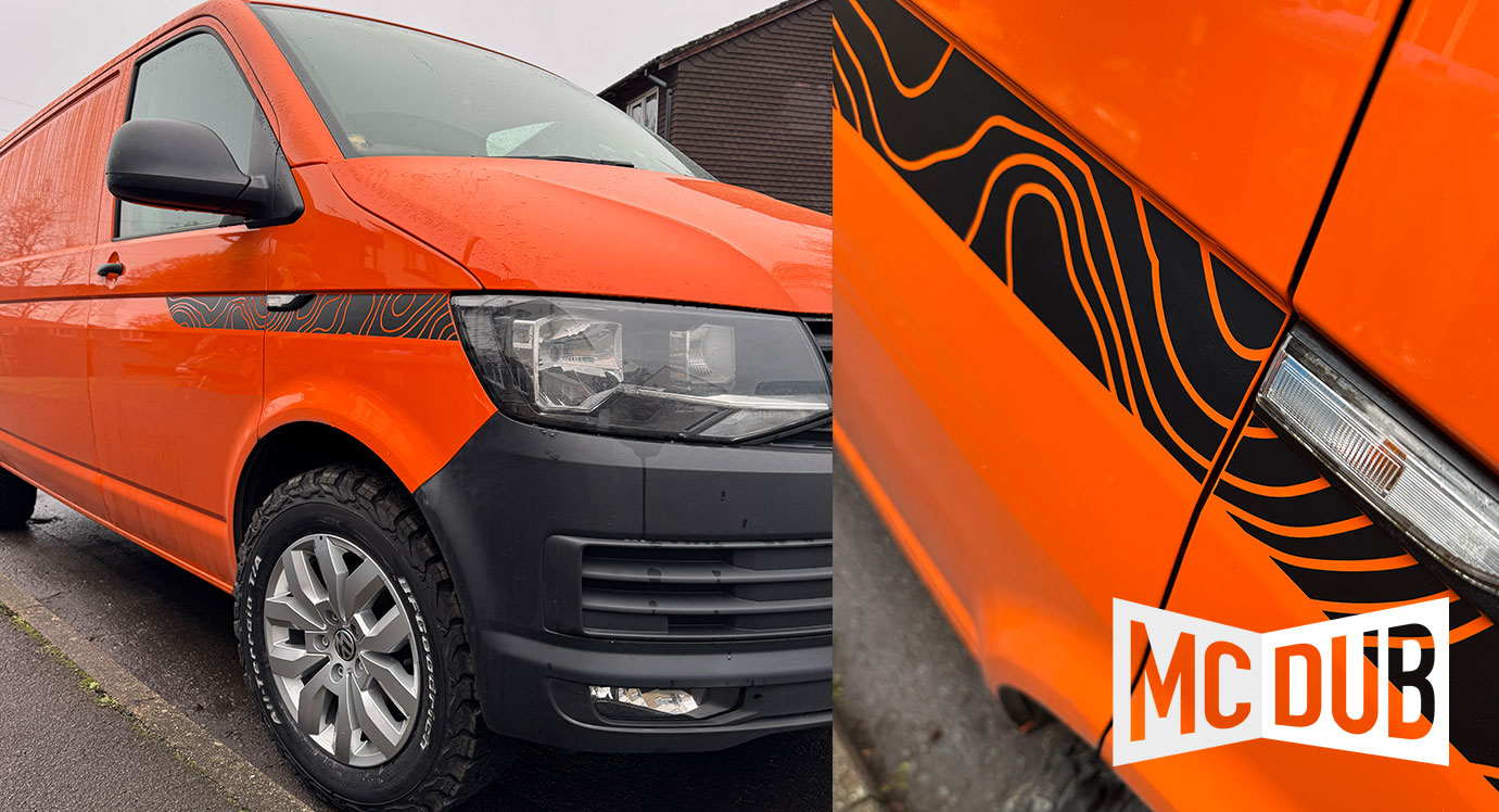
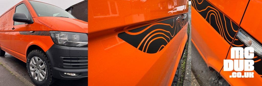
So with that said today’s session consisted of sound proofing the skin of the van with some thermo/acoustic treatment over the Dodo matting. This to me is a job that has become quite tedious if I’m honest and has definitely falling into the ‘sad job’ category. But to cheer me up and finish the session strong with a smile, I decided to apply some die cut map contour graphics to one side of the van (to make sure I liked them before doing the other side).
I have some experience with this technique in large and small scale graphics so for once I tackled a job with confidence. I’m really chuffed with the look and the graphic and feels it breaks up the orange a little and lends itself nicely to the modern 4×4 off road adventure look that I am going for.
Check out my fellow dubber
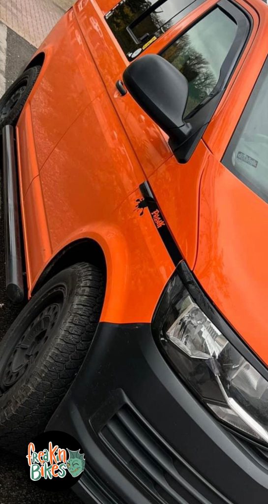
…and bike rider @freakin_bikes from Instagram. I’m loving this and inspired by the whole look from the way the subtle graphics wrap perfectly into the headlight eyebrows to the heavy duty tubular side rails.
Orange is a funny colour and in my opinion can look a little dated. The way to make it really work however seems to be the un apologetic and exclusive use of black which sits so well again the bright tones.
I also love the commercial black plastic bumpers. I’ve opted for this look myself. I also have black arches and side protectors on the way. This may prove to be overkill but I’ll do a dry fit and take a look before committing.
Don’t forget to give check out @freakin_bikes and give him a follow.
Are graphics your cup of tea? What are your thoughts?